

Dream Beyond Builders
A website redesign for a local builder to showcase services, pricing, and projects.
The goal for this project was to either design or improve a responsive experience for a real local business. Since I worked with a real client, strong communication and understanding their needs played a big role from start to finish. I partnered with this local business to design a professional, easy-to-navigate website that would help potential clients better understand services, pricing, and how to contact the team.
My Role: End-to-end UX/UI designer
Duration: 6 weeks
Team: Solo project
Tools: Figma
Primary deliverables :
Research analysis (interviews, affinity map, user personas)
User flows
Low- and high-fidelity wireframes
Interactive prototype
Usability test results and design iterations
Problem
Many local contractor websites are hard to find and often lack essential details—such as pricing estimates, service descriptions, or clear contact methods. This leaves potential clients unsure and hesitant to reach out.
How might we help users feel more confident when exploring a contractor’s website, so they can easily decide whether the contractor is a good fit?
Solution
Design a mobile-friendly contractor website that:
Clearly communicates services and pricing.
Includes testimonials and visual examples of past work.
Offers multiple, simple ways to get in touch.
Builds trust with users through transparency, professionalism, and ease of use.
What People Are Saying
“Even if they’re great at what they do, if the site doesn’t reflect that, I move on. It’s kind of like a first impression—it really counts.”
— Caleb
“That’s probably the #1 thing I look for (testimonials). I want to know other people were happy with the results before I trust someone with a big project.”
— Anthony
“I usually prefer filling out a form. It’s faster, and I can do it on my own time.”
— Valerie
Personas


Judy Martinez
Budget-conscious homeowner looking for transparent pricing upfront.
Anthony Reed
Detail-oriented property manager who prioritizes fast, clear contact methods and well-documented services.
The personas helped me understand what users were really looking for things like transparent pricing, easy contact options, and clear service descriptions. That insight shaped everything that came next, from the user flows to the sitemap and wireframes.
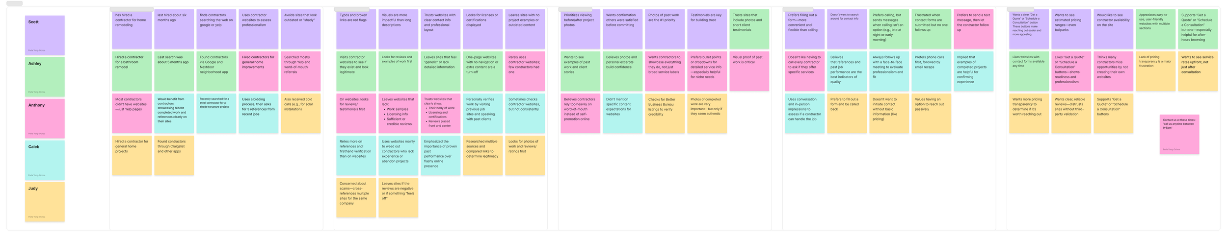
Affinity Mapping
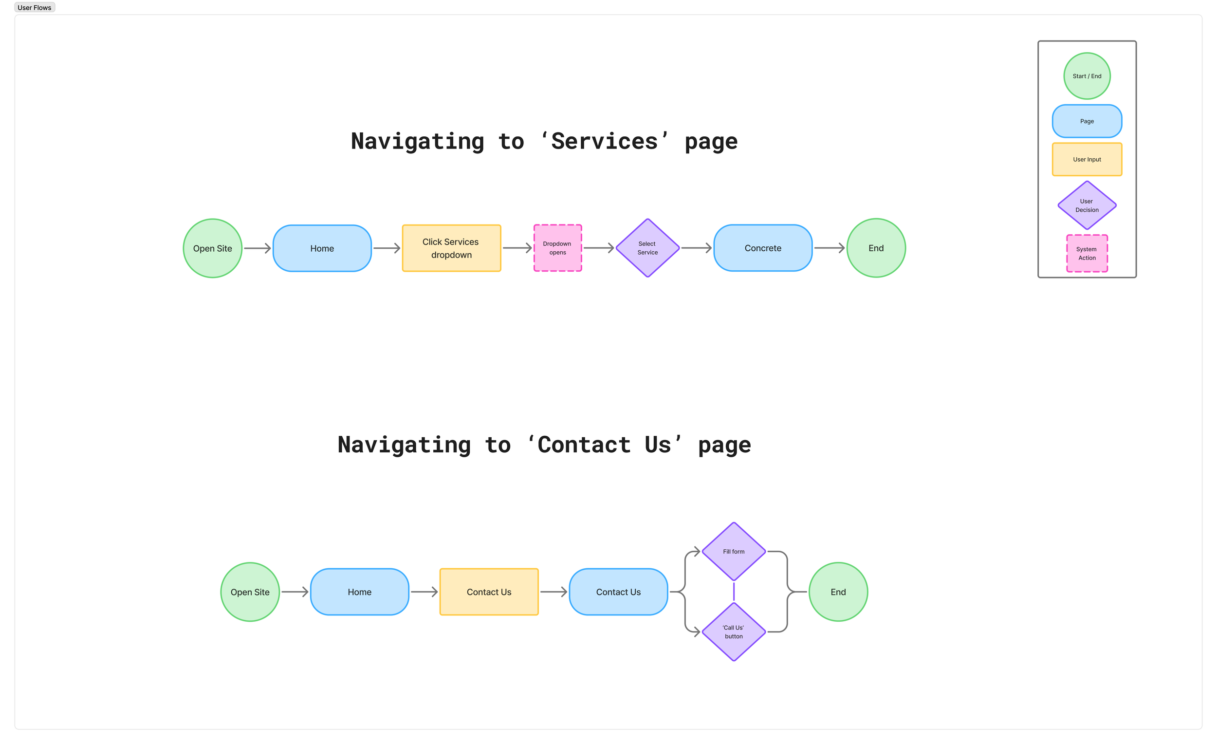
Mapping out user flows helped me clearly define how a typical visitor might explore the site—from landing on the homepage to reaching out for a quote. These flows ensured that the navigation was intuitive, and that users could easily access key information like services, past work, and contact options without unnecessary friction.
User Flows
Key Insights
Contractor Websites Are Hard to Find
Many users mentioned struggling to even find contractor websites, often relying on word of mouth or generic Google searches. This makes discoverability and basic SEO extremely important.Lack of Clear Service Information
Once users land on a contractor's site, they’re often left guessing what the business actually offers. People want to see a clean service list, ideally with descriptions, pricing estimates, and visuals.Trust Is Everything
Users say they’re unlikely to hire a contractor without signs of credibility—like testimonials, licensing info, photos of past work, or a visible team. A lack of these signals makes them question professionalism.Cluttered Sites Create Friction
Overloaded or poorly structured pages turn people away. Users want simple, easy-to-navigate websites with clear buttons and logical flows that guide them to a quote or contact form.Fast Contact Is a Big Deal
People are busy. If it’s hard to reach out or they’re unsure if anyone will respond, they’ll likely move on to the next business. Contact forms, visible phone numbers, and reassurance of follow-up help build confidence.
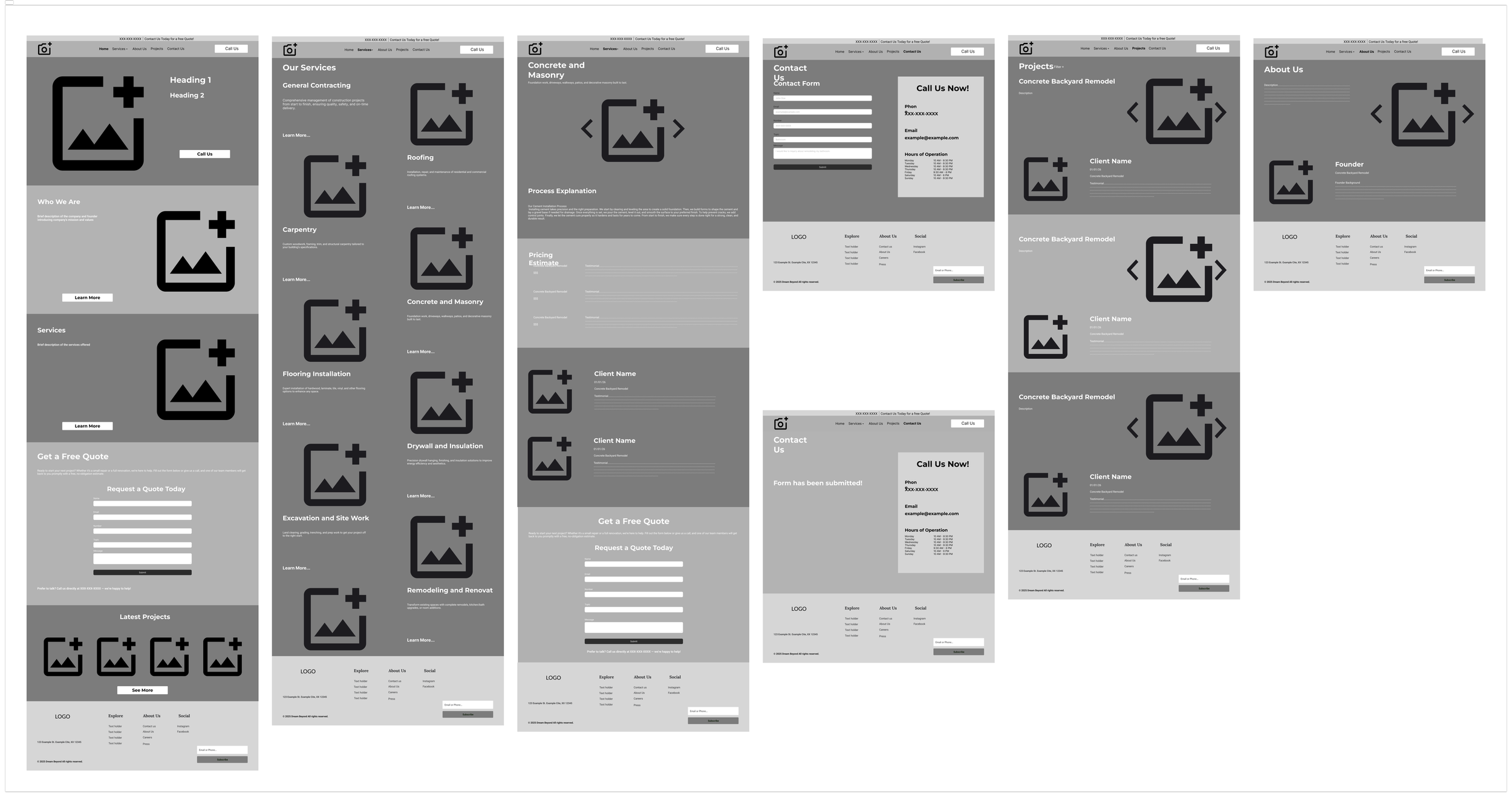
Wireframes
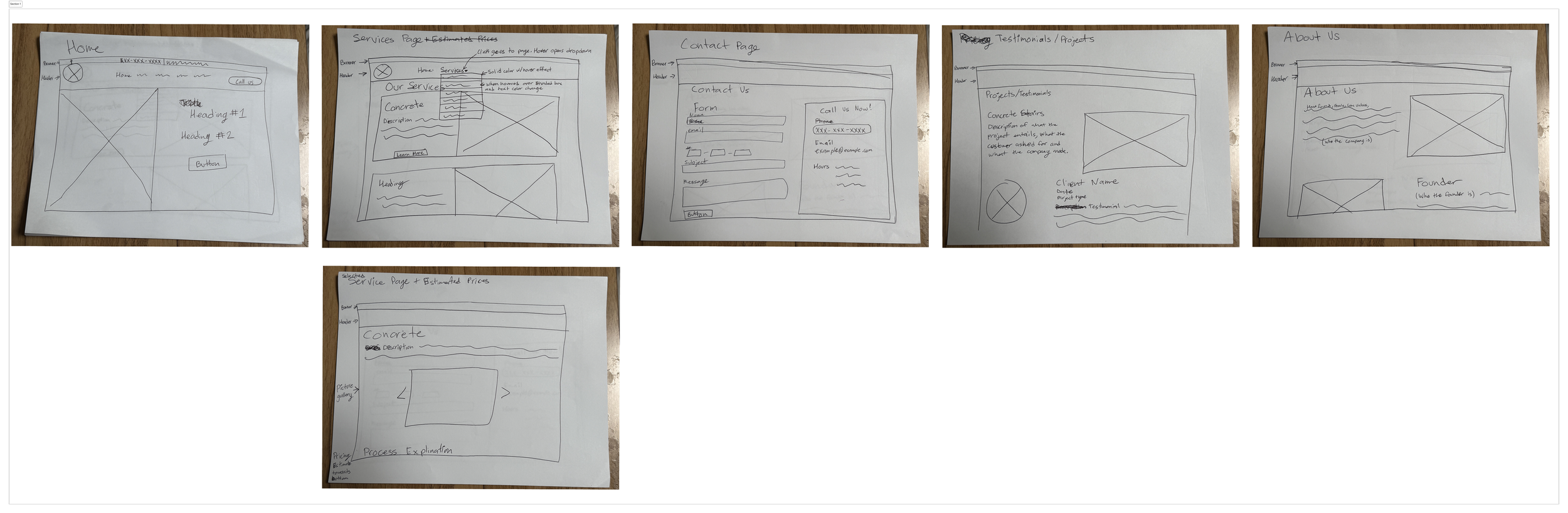
These low-fi wireframes were built from the user flows to visualize the structure and layout of each page before diving into visual design. They allowed me to quickly test layout ideas, focus on usability, and make sure the content and navigation met user needs without distraction from styling.
Mid-fidelity wireframes to test flows.
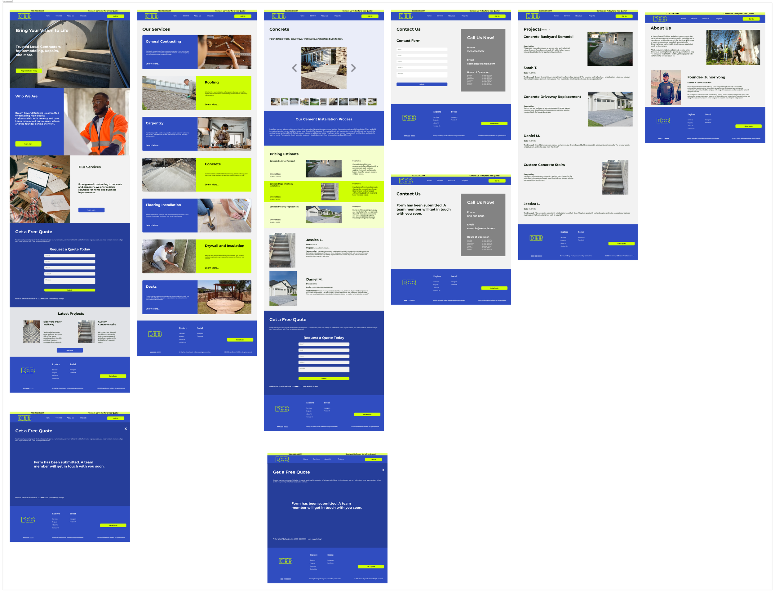
High-fidelity prototype with updated flow and interactive elements.
Test
I conducted one round of moderated usability testing using a high-fidelity prototype of the Dream Beyond Builders website.
Participants: 4 users (ages 30–55), including homeowners and property managers
Method: Remote testing via Zoom with guided tasks and follow-up questions
Key Tasks Tested:
Navigate to the Services page
Submit a contact request
View past project examples
What I Learned:
Users wanted more visual confirmation that their messages were successfully submitted.
The Services page needed clearer separation between offerings.
Some users expected the navigation to stick when scrolling.
Key Iterations:
Added a confirmation message after form submission
Improved content hierarchy on the Services page
Adjusted navigation behavior to stay accessible on scroll
Feedback: “This feels like a contractor I can trust—it’s clean and straight to the point.”

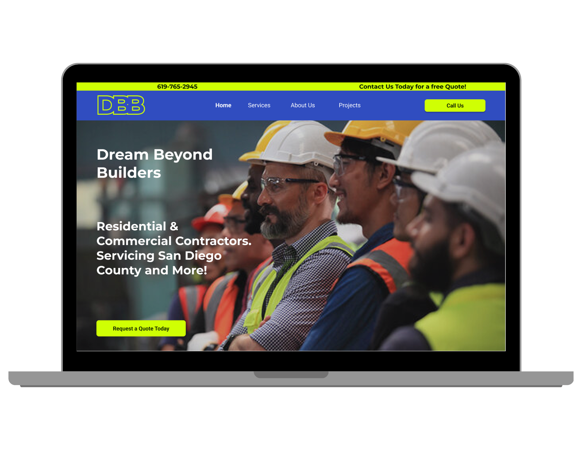
Completed prototype with final design adjustments.
Conclusion
Dream Beyond Builders now has a clean, trustworthy web presence that highlights their services, builds credibility, and makes it easier for users to reach out with confidence.
The site is structured around real user needs—clear service information, easy contact options, and visual proof of past work—while maintaining a professional and approachable tone.
Still, there are exciting opportunities ahead. What if users could request quotes based on service categories or project size? What if testimonials could be filtered by service type? Could adding a scheduling tool further reduce friction for potential clients? These ideas didn’t make it into the final version, but they point to future growth and refinement.
For now, I’m proud of where this project landed: a contractor website that’s simple, intuitive, and built to support both the business and its community.
What This Project Meant To Me
Dream Beyond Builders wasn’t just about building a contractor website—it was about building trust. Every layout choice, flow, and design decision was shaped by the real frustrations users shared during interviews. What made this project especially meaningful was getting to work with a real business—hearing their goals firsthand and turning their vision into something functional and user-friendly. It was both a learning experience and a proud moment to design something that could truly support a small business in showing up confidently online.