
TimeTogether
A mobile app that makes planning with friends feel easy, not exhausting.
People often spend 15–30 minutes across multiple messages trying to coordinate plans in group chats, with many giving up after two or three failed attempts. With TimeTogether, users can find a shared time slot in under 2 minutes by instantly viewing group availability—reducing planning friction and increasing follow-through on social plans.
This solo project was completed over 6–8 weeks and focused on solving a common modern-day struggle: finding time to connect with friends. I designed a mobile-first app that lets users share their availability and plan events—without the headache of endless group texts.
My Role: End-to-end UX/UI Designer
Tools Used: Figma
Timeline: 6–8 weeks
Deliverables: Research synthesis, affinity map, user personas, user flows, UI design system, wireframes, prototype, usability test results, and design iterations
Problem
Coordinating social plans is way harder than it needs to be. Most people rely on messy group chats or DMs, with no clear view of everyone’s availability. The result? Canceled plans, missed connections, and frustration.
Goal
Design a mobile app that helps users coordinate hangouts by letting them share when they’re free (without oversharing personal details), easily invite friends, and see when everyone’s available.
Solution
TimeTogether is a casual, privacy-respecting scheduling app made for real life. It replaces the chaos of group chats with a clean interface where friends can mark when they’re free, form groups, and create events—together.
Research
To validate the problem and design for real needs, I interviewed five socially active or moderately social adults (ages 25–38). I kept it casual and conversational, asking open-ended questions like:
“Walk me through the last time you tried to plan something with friends.”
“What’s the most frustrating part of group planning?”
“Would you feel comfortable sharing your calendar?”
Key Insights:
100% of users used group texts or DMs to plan—but all found it frustrating.
Most would rather show only when they’re free, not their full calendar.
Many give up planning after 2–3 failed attempts.
Simplicity and social comfort were huge; tools like Doodle felt too professional.
User Personas

Ashley Cooper – The Social Organizer
A friendly and outgoing 29-year-old who loves bringing her friends together for dinners, birthdays, and casual nights out. Ashley is often the planner in her group, but gets frustrated when conversations in group chats get messy or people don’t respond in time.
Pain Point: She’s tired of chasing people down and guessing when they’re free. She wants a simple way to coordinate plans that doesn’t require constant texting or oversharing her personal schedule.
Feature Connection: Inspired the free/busy calendar view and group availability features. Her feedback helped shape the core flows for marking availability, creating groups, and inviting friends—without the awkward pressure of full calendar sharing.
Affinity Mapping

I took the interviews and turned them into digital sticky notes to make the data easier to digest and organize. Each participant was assigned a different color, and their responses were grouped into categories like social habits, planning workflows, frustrations, privacy preferences, and feature ideas. This helped me visually spot patterns, repeated pain points, and unique behaviors across different users.
From this affinity mapping, several key insights stood out—most notably, that group planning through text can be frustrating and unreliable, and users want a simple way to share availability without exposing personal calendar details. The concept of showing just “free” or “busy” was consistently preferred, and most participants liked the idea of group availability views, quick confirmations, and even playful touches like GIFs or disappearing event chats.
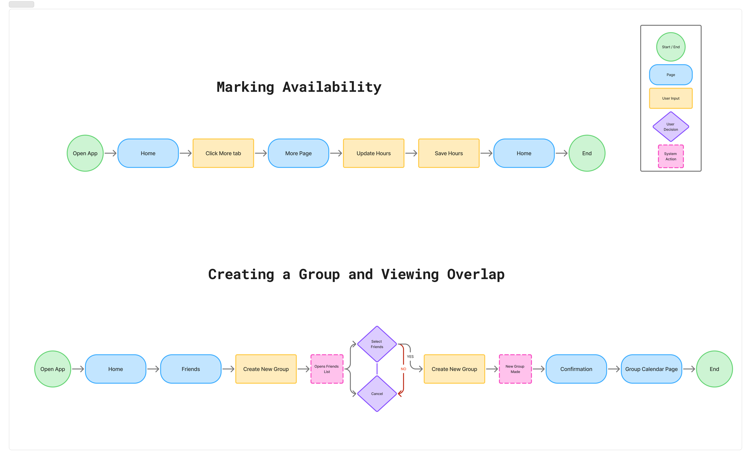
User Flows
These user flows map out the core tasks users need to complete—like setting availability, creating a group, and viewing the overlapping group calendar. Creating these flows early in the process helped me visualize how users would move through the app and ensured that each step was intuitive and efficient. They were essential for identifying potential pain points and served as a blueprint for the app’s structure and layout.
Site Map
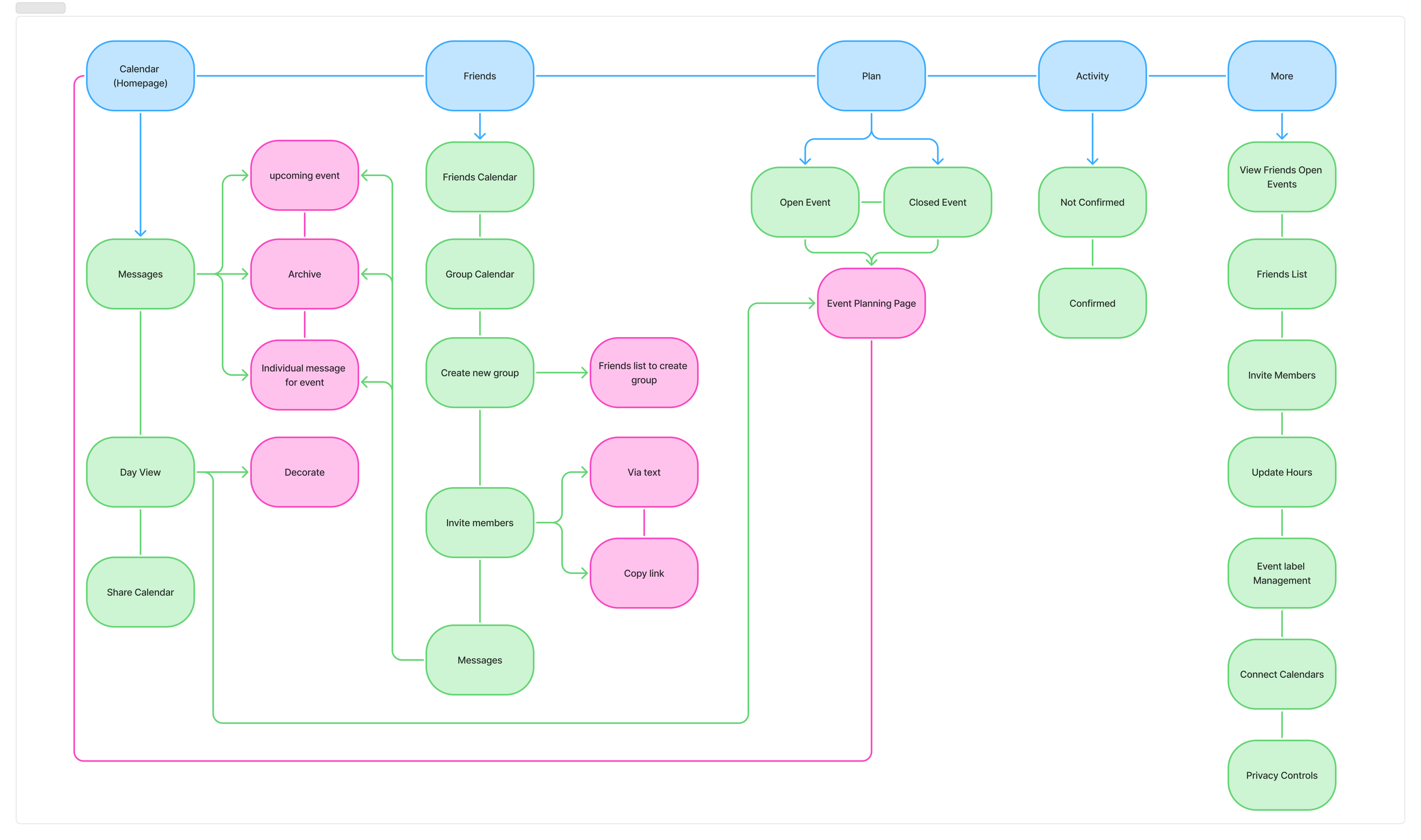
The sitemap outlines the overall structure of the app, showing how each screen connects and what content lives where. It helped me keep the navigation simple, organized, and user-friendly. By mapping this out early, I was able to ensure a logical flow between key sections—like Calendar (home), Friends, Plan, Activity, and More—so users can quickly find what they need without confusion.
UI Kit
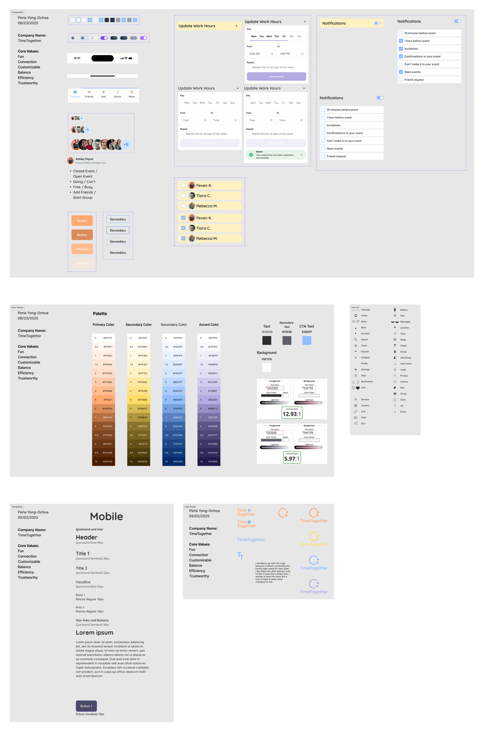
Brand Elements:
Logo & Wordmark: Rounded, minimal typography to feel warm and inviting.
Colors:
Primary: #FFA971 (peachy warmth)
Secondary: #FFDB66 (yellow), #92BDFF (sky blue)
Accent: #B2ACE1 (lavender)
Background: #FAF7F8, Text: #2D2D2D
Typography:
Headers: Quicksand — friendly and round
Body: Inter — clean and readable
My favorite part of the design process was creating the high-fidelity mockups—it was so rewarding to see the app come to life visually and match the calm, casual vibe I was aiming for.

Wireframes
I started with paper wireframes to quickly explore layout ideas and validate flows. From there, I moved to high-fidelity screens in Figma and built a full interactive prototype
Test
I ran two usability tests—one with paper wireframes, one with high-fidelity prototypes.
Participants: 5 socially active users (ages 26–38)
Method: Remote testing via Zoom, screen sharing through mobile devices
Key Tasks Tested:
Mark availability
Create group
RSVP to an invite
What I Learned:
Users wanted clearer feedback when marking availability.
Group creation flow needed refinement.
People expected to RSVP directly from the calendar, not just an activity tab.
Key Iterations:
Added better RSVP buttons and improved activity sorting
Clarified free/busy toggles with color and visual feedback
Updated group view structure for easier navigation
Feedback: “This feels intuitive and casual. I’d actually use this.”

Conclusion
This project reminded me how powerful a simple, thoughtful solution can be. I learned how to translate emotional pain points (like frustration and overwhelm) into clear design decisions.
Challenges: Balancing privacy with group visibility
Learnings: Always test earlier—users catch what you don’t
What I’d improve: Add onboarding, better reminders, and “smart” suggestions
Proud Moment: Turning messy planning into something clean, calm, and fun to use.
Next Steps
Add a short onboarding to explain core features
Build smart suggestions for best time to hang out
Allow customization of group names, colors, or icons
Improve notifications and reminder system
Small Fixes. Real Change.
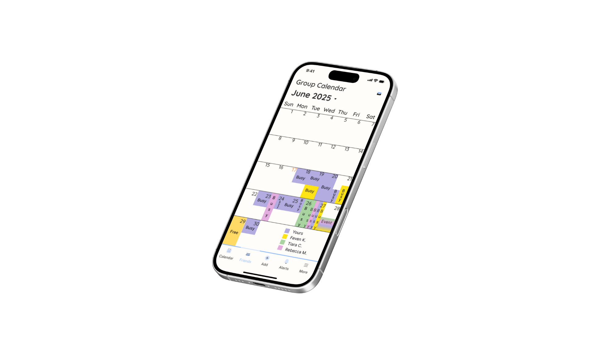
Final Product
Final Product
The biggest success of TimeTogether wasn’t a flashy feature—it was hearing users say, “I’d actually use this.” By simplifying how people share availability and plan casually, I focused on solving a real-life friction point with empathy and clarity. This project reminded me that sometimes the best UX isn’t loud—it just quietly makes life better.